Order Status Page

Not too long after shipping Checkout, we decided to shift our focus to the post purchase experience, aka what happens once you complete your order. This project also served as a great way to experiment with our process.
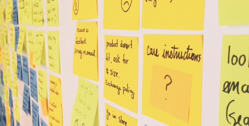 Thanks to Cynthia Savard Saucier for introducing me to this method and leading the session.
User journey
We started off by locking ourselves in a room in our office with a bunch of sharpies and a stack of post-its. Our goal for this exercise was to uncover different problems that occur once the order is placed.
So we started listing off everything that could happen: you receive a confirmation email, you maybe archive it, then you might forget about your order for a while. Now, maybe you remember you still haven’t received your package and you start wondering what happened to it. So you search your emails, find the original email and maybe contact the merchant to ask when your package is supposed to arrive.
This is just one of the many scenarios we uncovered.
One thing we noticed was that there were moments when the experience was actually quite good, like the excitement you have once you’ve completed your order, and others that were not so great like not knowing when you’re going to receive your order. So we then went in and thought of potential solution to turn a bad experience into a good one and a good experience into an even better one.
That was a fun process for me. Dreaming up ideas freely without even trying to make everything fit together yet. We could make sense of everything later. By not sitting down in front of a computer right away, it helped not getting attached to one particular solution and discuss them all on equal footing.
Not sitting down in front of a computer right away helped us avoid getting attached to one particular solution and allowed us to discuss them all on equal footing.
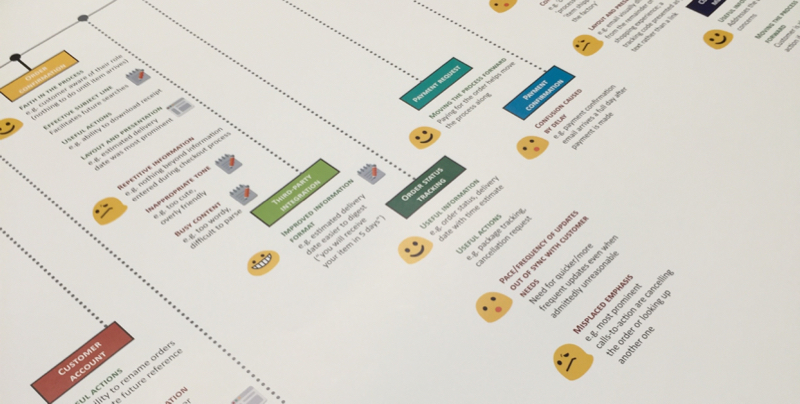 Shout out to Dalia El-Shimy for creating this amazing poster with all of the research findings.
Reality check, aka user-research
At that point, we got results from the research that was done by our UX research team. Dalia, our rockstar researcher, likes to experiment with different ways to present results so this time she made a big poster with all the findings. That was a great way to bring awareness to the project to the whole office, while making the information easier to understand. That’s the moment where we go back to our room full of post-its and see what we got right and what we got wrong. It allows us to calibrate what we think with what actual users think the problems are.
We also pull in relevant data to help us understand the full picture. We looked at things like the percentage of recurring customers, percentage of stores who customize the order receipt, etc.
From that came a big problem and one opportunity:
Merchants spend an incredible amount of time replying to emails about the status of their customers order. By bringing more clarity in the shipping process, we could give merchants more time to focus on their business and increase customers’ trust in the merchants and in turn increase the likelihood of them returning to that store later.
That’s how the Order Status Page project was born.
The plan
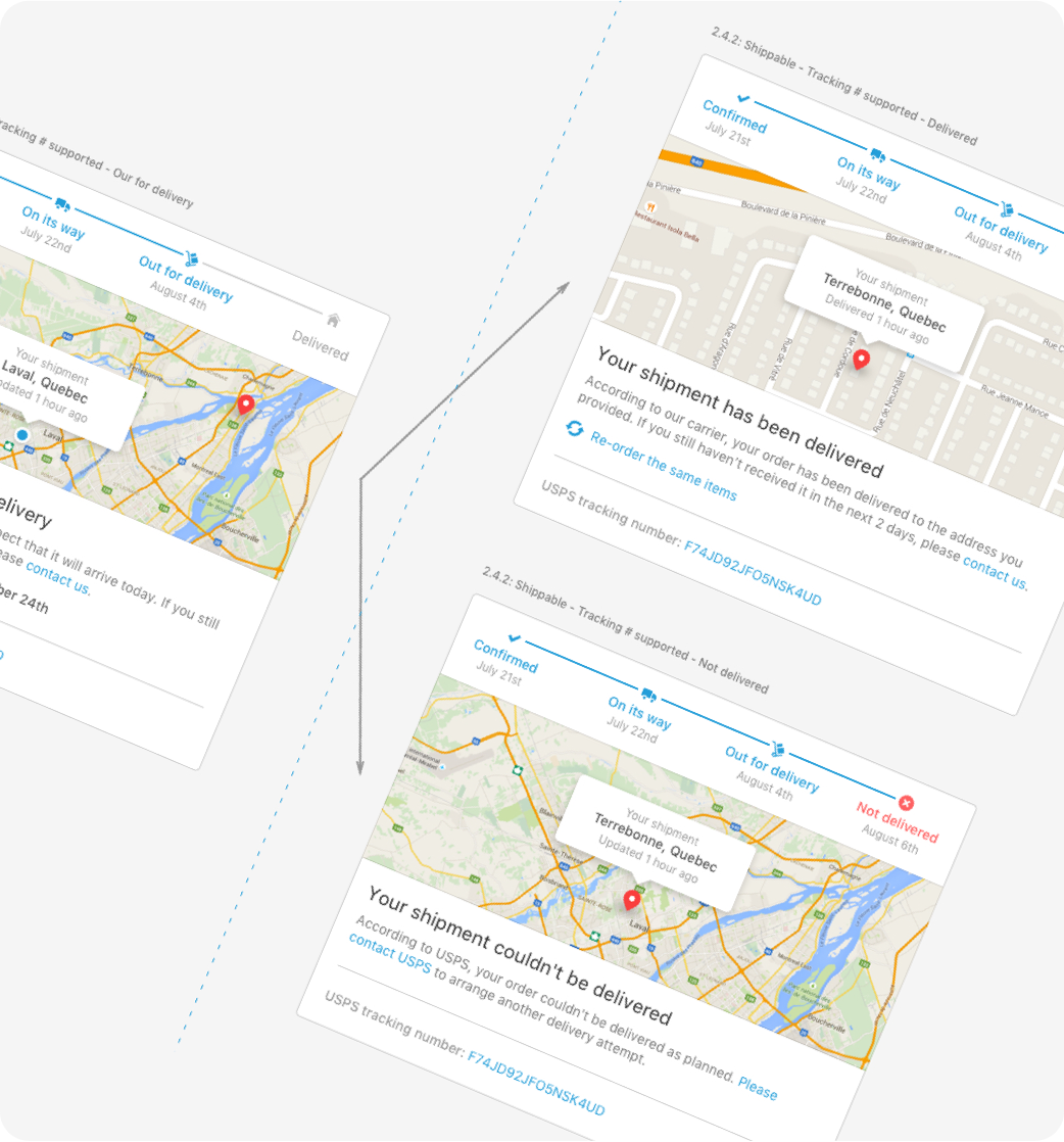
After many discussions, here’s what we ended up with: have a page where customers can see the shipping status updated in real-time with estimated delivery date and easy-to-find contact information.
We also came up with a series of design principles that would help us determine if the project was successful:

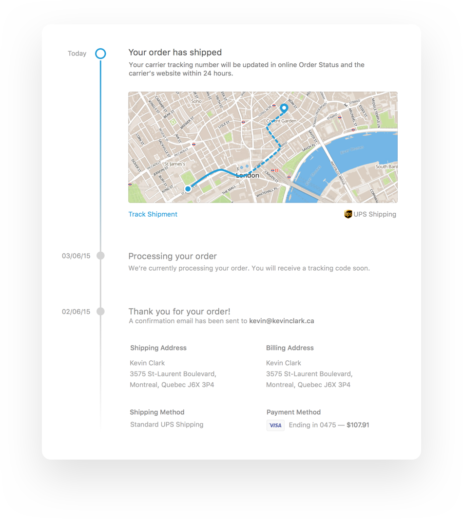
We then started to explore different ideas for how to best present the information we wanted to present. My first idea was to treat it like a message thread. Events would show up in a linear fashion. I thought it was a clever way to see a history of your package over time.
The timeline... didn't work out
The more I worked on it, the more I realized that the full history didn’t matter that much. Most people care about where their shipment is right now, not two weeks ago. It also raised a lot of questions around where should the most recent content appear, at the top or at the bottom of the page? So I decided to move on to a different concept.
Cards
Next, I thought about using collapsible cards to display only the most relevant information, but also giving a hint of what came before. This direction obviously worked a lot better than the first one, but it felt like something was missing. This approach was lacking a fundamental emotional aspect: each step should feel like you’re accomplishing something, like you’re one step closer to getting that awesome pair of headphones you’ve been waiting for. In other words: it lacked delight.
I then decided to try to merge the two ideas together. Keep the cards, but bring back the progress bar. On top of helping you know exactly where you are in the process, progress bars bring an inherent playfulness to the page. As humans, the desire of seeing a progress bar fill up is hardwired into our brain.
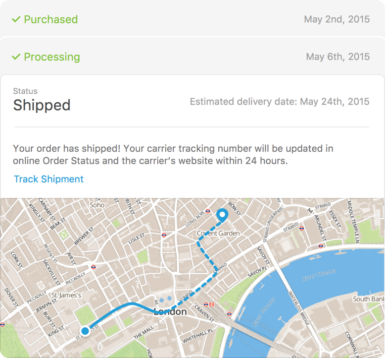

Getting the style of the bar just right turned out to be a bigger challenge than I thought. I needed it to be flexible, easy to understand and visually interesting without being overpowering.
Putting it all together
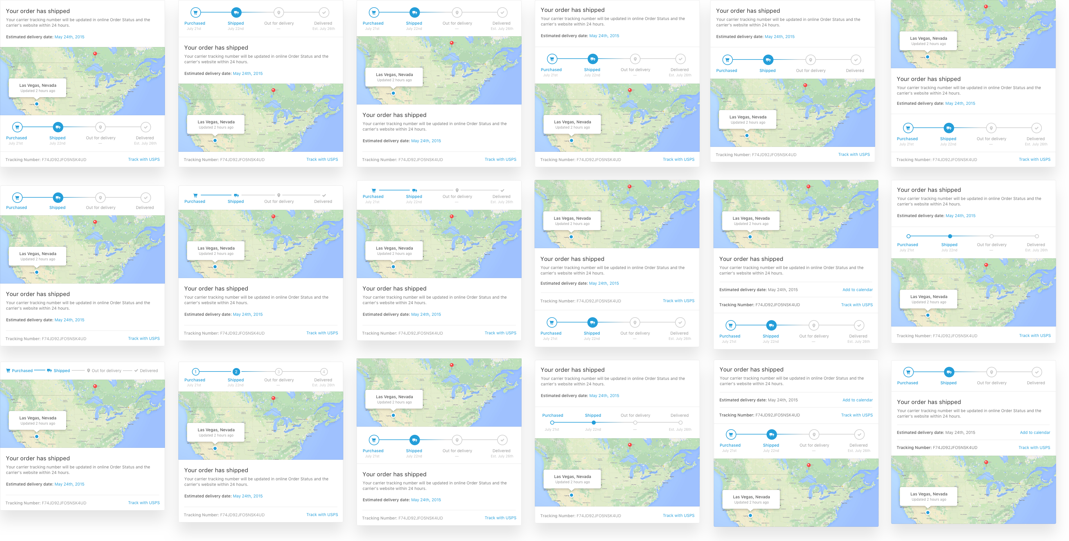
At this point I had all the components: the progress bar, the map, the description, the related information like the tracking code, etc. All I had to do was put it all together. Simple, right? After just a few hours I had roughly 30 different ways of assembling the information, each one of them having their pros and cons. It was time to decide which one was the best.
To better visualize everything, I printed every card on a piece of paper and asked my colleague Markus to help me cut them and decide on our favorites.

The Flow
Now that we had our card designed, it was time to cover all of our bases and make sure we didn’t forget any essential part of the fulfillment process. There were a lot of variables coming into play: is the product a digital good? Do we have a tracking number? Is the carrier supported by Shopify Shipping?
Trying to maintain a map of all of that into all of our head started to become problematic, so I decided to create a flow diagram to make sense of it all. It also helped me refine my design system to make sure it could accommodate all cases
Our content strategy team also helped out quite a bit to make sense of all the different codes returned by shipping carriers and create content that was consistent and easy to understand. We put a lot of thought into the copy we used because we knew that this would make or break our design.
Putting all of these pieces together really helped us get a better sense of how the entire process would be like from beginning to end and how the different flows branched out.
What I learned
- Your design is only as good as the content. When you’re talking about increasing trust and clarity, content is extremely important. Having content strategists involved from a very early stage allowed us to produce design that suits the content, rather than the opposite.
- Fall in love with the problem, not the solution. A very valuable part of design happens away from the computer. Earlier in my career I would often jump to solutions as soon as possible without having that complete understanding of the full context. On this project I realized that by taking the time to research and listen and understand, I could not only make better solutions but it would also be faster in the long run because everyone on the team was aligned on the same goals.
- Try everything. When you’re exploring design solutions to the problems you’ve discovered, make sure you try a lot of different ideas. It’s highly unlikely that your first idea ends up being the best one, but when you’ve tried everything the solution is forcibly hidden somewhere in there. For this technique to work you also have to turn down the judgmental part of your brain. Your goal here should be to produce a lot of different ideas, you’ll decide which ones make the cut after.
